
Case Study / Mobile Site
B2B SaaS Live Commerce
-
Design a B2B mobile site for Livuvo, a Live Commerce and Interactive Video Marketing SaaS Platform
-
Figma
FigJam
Photoshop
Trello
Slack
Google Forms
Google Meet
-
Gabriel James Johnson, UX/UI Designer
Bahare Ghonche, UX/UI Designer
-
4 weeks to delivery of high fidelity prototype
-
User Experience
Competitive Analysis
User Interviews
User Survey
Affinity Diagram
Empathy Map
User Persona
User Journey Map
Problem Statement, MoSCoW Map
MVP Statement
User Flow
Low and Mid Fidelity Wireframe and Prototype
User Testing
User Interface
Visual Competitive Analysis
Style Tile
Design System
High Fidelity Prototype
Challenge
Livuvo is a B2B Live Commerce and Interactive Video Marketing SaaS Platform. It was conceived to pair live video technology and real-time communication to bring a more humanized experience to existing commerce platforms.
For this project, we aimed to enhance Livuvo’s digital presence through an improved mobile site with responsive design that can easily be scaled to a desktop version.
Goal
Our objective was to create a prototype that would spur B2B lead generation; the user interface should reflect Livuvo’s current branding with improved information architecture, concise product descriptions and improved clarity overall. We aim to enhance Livuvo’s digital presence specifically through clear call-to-actions, compelling visual storytelling and comprehensive user education.
UX / Stakeholder Presentation + Interview
Online shopping is the norm, and live commerce stands out as a key factor in bringing back the human touch to the shopping experience. It enables businesses to create a more personalized shopping journey, catering to the needs and preferences of each customer.

Our kickoff meeting with Ehsan Tarighat, Livuvo’s co-founder, provided crucial insights into the company’s vision, user expectations, and the technical capabilities of the platform.
Among other things, this portion of the session confirmed that our focus would be creating an enhanced mobile website for Livuvo focusing on B2B lead generation.
After a brief introduction and icebreaker, our presentation led with the following questions:
Priority and Access: Do you prioritize desktop or mobile screens for development, and can we arrange interviews with some of your clients (B2B or B2C) for user research?
Website Objectives and Content: Which features are essential to retain, which need reworking, and could we review your dashboard visuals? What primary objective does your website serve (e.g., lead generation, product information), and what's the ideal outcome you expect?
User Insight: Could you outline the typical user profile for the platform and explain how Livuvo meets their needs?
Impact: What impact do you envision Livuvo having on users and their shopping experience
Problem-Solving: What are the key issues Livuvo aims to address with its live commerce platform? Have users encountered specific challenges during online shopping that Livuvo intends to resolve?
Competition and Differentiation: Who are your main competitors and how does Livuvo differentiate itself in the market?
Assumptions and Validation: What assumptions have you made about your market, technology, or users, and are there any hypotheses you're looking to test or validate through this project
Challenges and Goals: Could you share the principal technical and market adoption challenges Livuvo is currently facing? What's the primary short-term goal for the Livuvo app?
UX / Assumptions
We then moved onto our initial research-based assumptions regarding Livuvo’s current site’s needs:
Clearer Calls-to-Action (CTA)
Livuvo aims to drive sales and user interactions through its platform.
Recommendation: Ensure that CTAs are clear, visually prominent, and strategically placed to guide users towards desired actions.
Visual Storytelling
Livuvo's commitment to interactive videos implies a focus on visual content.
Recommendation: Leverage visual storytelling techniques to showcase products and the platform's capabilities. Engaging visuals can enhance the overall user experience and convey the brand message effectively.
User Education
Livuvo aims to educate users about its unique features and benefits.
Recommendation: Implement interactive tooltips, tutorials, or onboarding processes to educate users about the platform's functionalities. This can enhance user understanding and engagement.
Responsive Design
Users engage with Livuvo through various devices.
Recommendation: Implement a responsive design to ensure a consistent and enjoyable experience across desktops, tablets, and mobile devices.
Ehsan then walked us through the Livuvo user dashboard and gave us a comprehensive demonstration of the platform’s features and capabilities. We asked for additional insights, addressed his questions and gave an overview of the design thinking process and the methods we would use to bring this project to life. To close, we conducted a very productive brainstorming session and aligned on deliverables and timeframe.
UX / Features Analysis + Competitor Mapping + Brand Analysis
Our extensive market research included a detailed analysis of features offered by competitors, mapping their strengths and weaknesses. We also conducted a thorough brand analysis to understand how Livuvo can differentiate itself in the live commerce space
Click to enlarge.

UX / User Interviews + Survey
Direct feedback from users through live site navigation interviews and an interactive video survey revealed key user pain points and preferences. This data was instrumental in shaping a user-centric design approach for Livuvo, ensuring that the platform meets real user needs.

UX / Affinity Diagram
The affinity diagram helped us categorize and make sense of the vast user feedback. It enabled us to identify patterns and common themes that are essential for understanding user behavior and expectations.

UX / User Persona + User Journey Map
Creating a primary user persona and mapping her journey allowed us to empathize with our users, understanding their goals, challenges, and interactions with Livuvo. This empathy forms the backbone of our user-centered design approach.
Click to enlarge.


UX / Problem Statement + MoSCoW
Our problem statement focuses on addressing the identified user needs and business goals, defining the core challenges that our design solutions aim to solve in enhancing the Livuvo experience.
The MoSCoW method helped us prioritize features and functionalities into 'Must have', 'Should have', 'Could have', and 'Won’t have'. This ensures that our design efforts are aligned with the most critical aspects of the user experience.

UX / Minimum Viable Product (MVP)
We delineated the features essential for the MVP of Livuvo, ensuring it delivers value to users while remaining feasible and aligned with business objectives.

UX / Site Map + User Flow
The MVP statement kicked off the UX ideation process and culminated in an improved site map. The site map and user flow diagrams are crucial in visualizing the structure and navigation of Livuvo, and ensure a logical, intuitive user journey through the platform.
One major change we implemented was expanding the existing site's information architecture into 6 tabs, based on user insights and needs: Products, About, Resources, Success Stories, Pricing, and Book a Demo.
The user flow follows Emma from first opening the site to researching the products to testing a trial product to completing a purchase.
Click to enlarge.


UI / Concept Sketches
Concept sketches represent our initial design ideas and are the first step in information architecture, providing a visual representation of potential solutions to the design challenges identified.

UI / Medium-Fidelity Prototype
The medium-fidelity prototype is a more detailed representation of the product, focusing on layout and functionality, which is essential for early testing and feedback.

UI / Medium-Fidelity Usability Testing
Usability testing provided us with further insights that helped refine our medium fidelity prototype. Relevant input was reflected in our high fidelity design.

UI / Visual Competitive Analysis + Style Tile + Components
A visual competitive analysis allowed us to benchmark Livuvo’s UI against competitors, identifying areas for visual differentiation and enhancement. The style tile presents the proposed visual language for Livuvo, including colors, typography, components and iconography, ensuring consistency across the platform.
Livuvo already had a striking color palette and strong logo, and we wanted to retain their existing scheme. The only addition to the color palette was a neon yellow/green accent, and the font was changed from Montserrat to Helvetica for increased readability.


UI / Iteration + Reiteration

UI / High-Fidelity Prototype
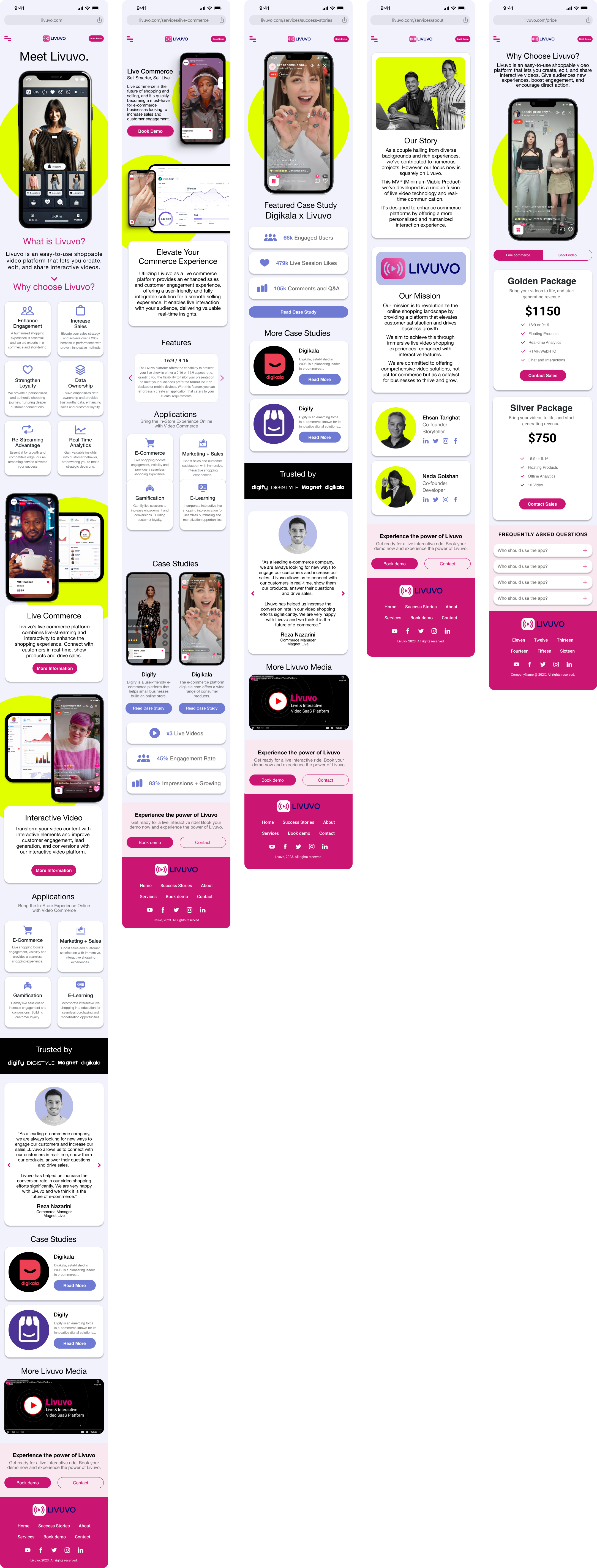
UI / Interactive Prototype
For full functionality, view at fullscreen on desktop.
Comparison
From left to right are Livuvo's existing mobile site and our updated version. I like to think that we were successful in complementing Livuvo's written content with striking mobile-friendly visuals that will give potential users a more comprehensive picture of Livuvo's services.

Next Steps
This project has laid the foundation for a transformative rebranding strategy, but our journey doesn't end here.
Moving forward, we will delve deeper into the nuances of user engagement through desirability testing, ensuring that our solutions resonate with the market's preferences. We will maintain an iterative process, integrating client feedback at every stage to refine our approach continually. Exploration of additional paths will also be on our agenda to maximize reach and impact.
Moreover, we are set to expand our digital presence by developing a desktop version that complements the mobile experience. Our collaboration with the client will continue in this phase, through a company name change and the rollout of a full-scale rebranding encompassing both mobile and desktop sites.